Our refreshed brand is here!
Introducing our new trefoil and section brands
After years of research and design, our refreshed look and feel has arrived.
Lots has changed, from our fonts to how we talk. But some of the most noticeable things are our trefoil, the way our sections look and our new brand purpose.
We help all girls know they can do anything
Our brand purpose is what drives us forward.
Through research, we discovered that our old description, 'Girlguiding is the leading charity for girls and young women in the UK', didn’t really explain who we were to people outside Girlguiding. Using ‘charity’ meant that it wasn’t clear that we offered fun and adventure for girls. It wasn’t showing we were actively doing things to help girls build confidence, make friends and change the world.
Our new brand purpose, 'we help all girls know they can do anything', does that.
- We help: shows that we’re a supportive organisation. Using ‘we’ highlights importance of togetherness and belonging.
- All girls: we’re an inclusive organisation, and everything we do aims to bring the guiding experience to as many girls as we possibly can. It reinforces the community that powers Girlguiding.
- Know: this reflects the courage and confidence of what we offer to girls.
- They can do anything: ‘do’ is active and is about participation and the attitude of trying new things. Both the activities we offer week in week out, and also a mindset that they can take out into the world, a way of seeing that there are hundreds of possibilities waiting for them to get stuck into.
Our new campaign film brings our brand purpose to life:
The Girlguiding brand
The main brand is Girlguiding, which connects all the section brands, and links everyone and everything we do together. Each section looks similar and has elements of the main Girlguiding brand, but they’ve all got distinct parts at the same time, to show the unique personality of each section, and how they are different from each other.
They’ve all been designed with girls at their heart and they’re designed to grow with them as they go from childhood into young adulthood. They’ve all been tested with different groups from across the UK too, so we know that the sections, and the main brand, appeal to lots of people.
The trefoil
One of the biggest changes to the main Girlguiding brand is the symbol that brings us together: the trefoil.
The new design of the trefoil has been created to represent and retain our heritage, while being modern and easy to use.
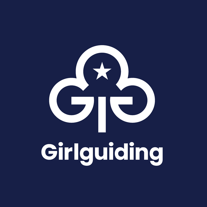
Each part of the trefoil has a meaning. The three leaves represent a part of the promise:
- Self: being true to myself and developing my beliefs
- Others: serving the King and my community and helping other people
- Keeping the Guide law
The guiding star represents the Guide law. It’s a star with five points, 10 if you count the inner points as well, standing for the original 10 laws.
This video explains the Brownie and Guide laws in more detail:
The 2 Gs represent Girlguiding and are a reference to earlier versions of our trefoil.
The stem of the trefoil points forwards and towards the guiding star, showing the direction members are always going in.
The sections
We want everyone who sees our section logos to understand they're part of the Girlguiding family, so they all use the same font as the main brand, a free downloadable font called Poppins, and have a similar design – while still being distinct from each other.
Here’s some more details about the logos and colours for each section:
Rainbows
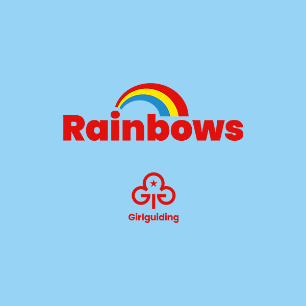
The main two Rainbows colours have stayed similar to the previous look and feel, and are designed to be attention grabbing, playful and work better online. The symbol for Rainbows is a simplified rainbow, with a swoosh design that represents growth and development as girls go from starting Rainbows at 4 to being ready to move to Brownies at 7.
Brownies
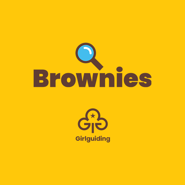
The iconic yellow and brown of the Brownies have stayed, just with an update to the exact shades of each colour. The new ‘golden’ yellow is used a lot more than it was before so the section looks really vibrant, exciting and reflects the girls’ requests for less brown. The symbol for Brownies is a magnifying glass to show how curious and adventurous girls in this section are.
Guides
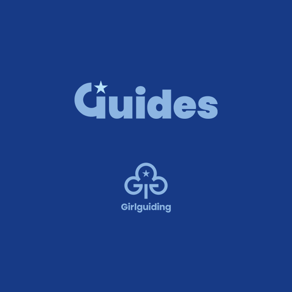
The new Guide colours have been designed to complement the main Girlguiding brand colours, because it’s our original section. Because Guides is a transition age, the design has a more ‘grown up’ feel. And because it’s the original section, its symbol includes the important guiding star from the trefoil.
Rangers
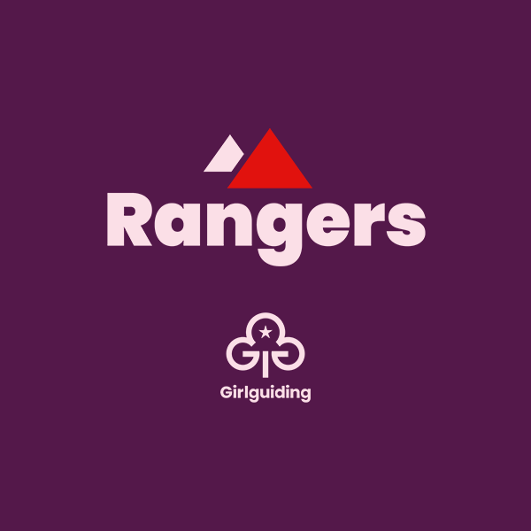
Rangers have had the biggest change of all the sections. The new Ranger colours have been designed to be dynamic and more grown up for our oldest section. The Rangers symbol is 2 triangles, and these can be seen as arrows or mountains - they show how proactive and optimistic Rangers are, and reflect the ‘mountain top moments’ they experience.
Find out more about the refreshed brand
This is a really exciting time for everyone in Girlguiding. Our new look and feel will make us feel more relevant to our young members, is more attractive for people who want to join us, and is easier to use in a digital age.
Discover how to use the refreshed brand:
Want to buy giftware in the refreshed brand? Go to our online shop. Refreshing our brand will be a gradual process. We’ll keep you posted with any updates, from volunteer recruitment later this year to uniform changes in 2026. And if you’ve got any questions, email [email protected].
